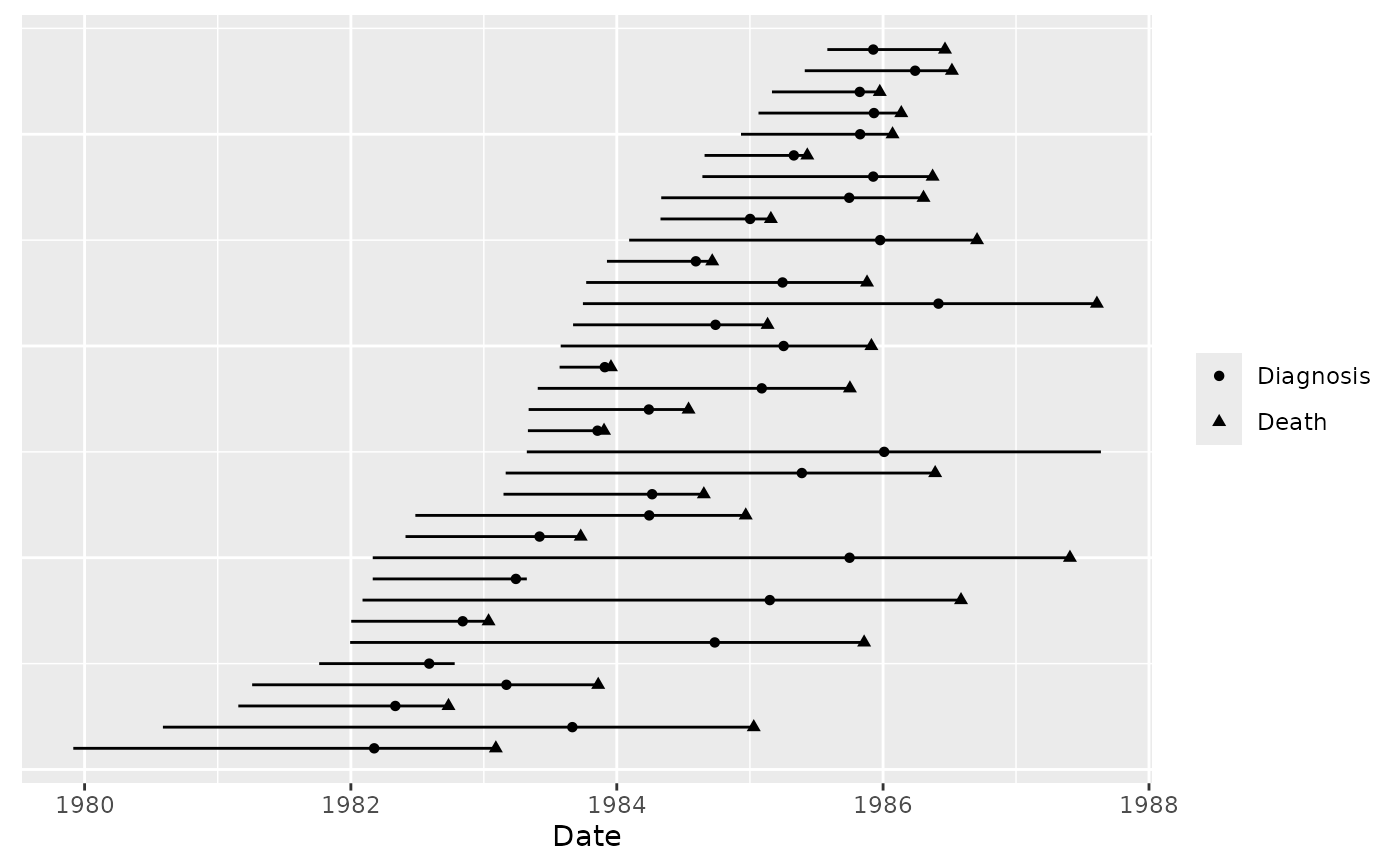
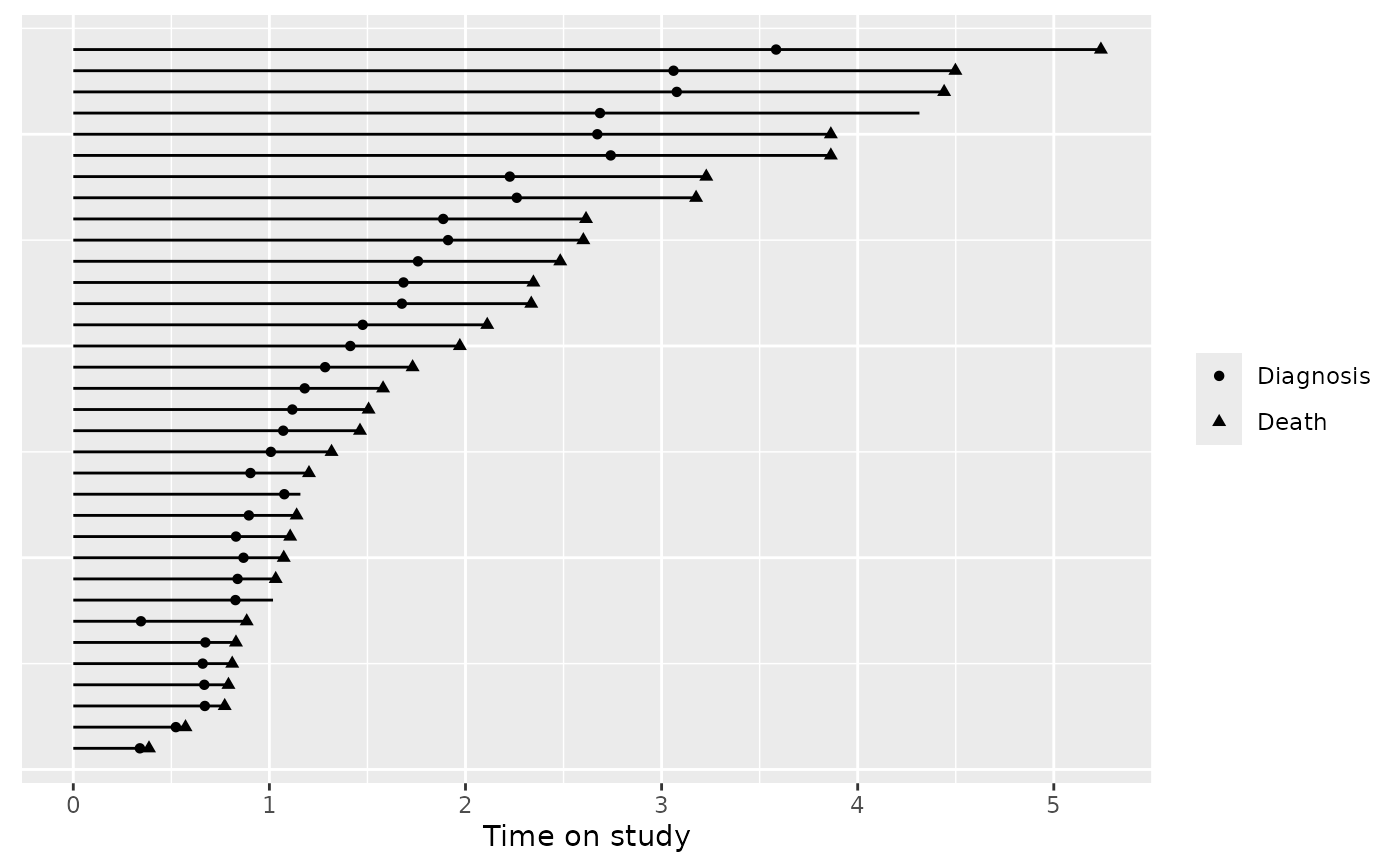
Create a time-to-event chart using ggplot
event_chart.RdInspired by Hmisc::event.chart()
Arguments
- Data
A data frame or data.table of dates, organized in the following way (the first two columns are plotted with a line segment, the remaining columns are plotted with a symbol):
Column 1: Follow-up start date
Column 2: Follow-up end date
Additional columns: Additional events that may occur during the follow-up period
- shift
Shift time so that 0 represents start of follow-up for everyone? (default: FALSE)
- scale
If shifted, what units? (default: scale=1, meaning days)
Examples
df <- read.csv(system.file("extdata/cdcaids.txt", package="breheny"))
event_chart(df, FALSE)

event_chart(df, TRUE)

event_chart(df, TRUE, 365.25)
