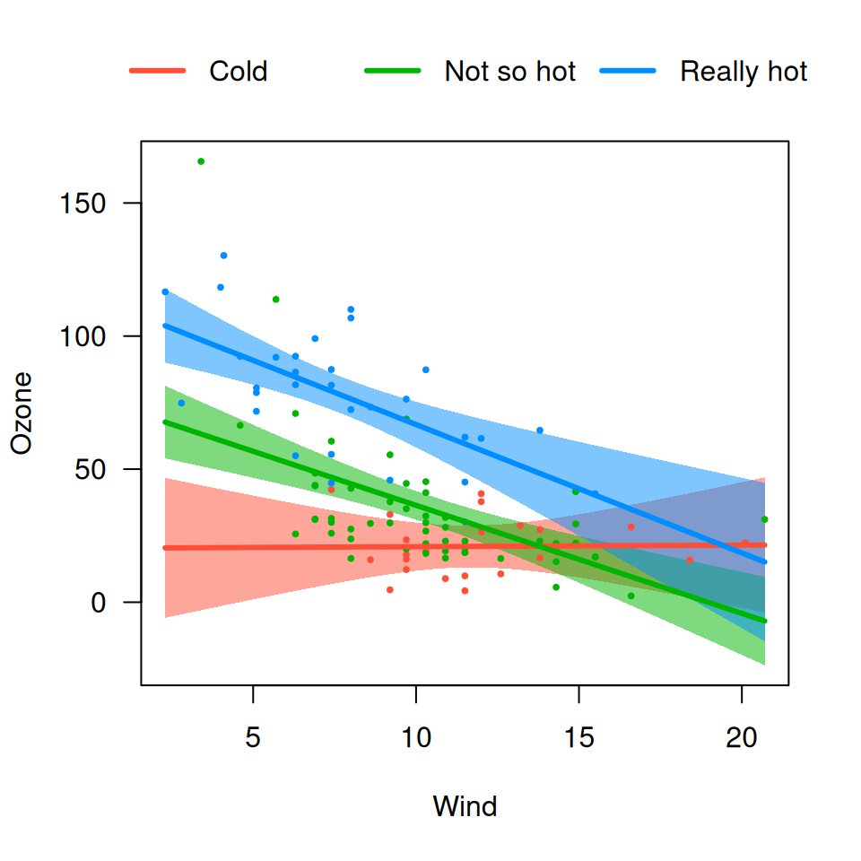
The default cross-sectional plot places the different cross-sections in separate panels. Occasionally, it is more helpful to overlay the plots on top of one another to see more directly how they compare. Using the same model as before:
airquality$Heat <- cut(airquality$Temp, 3, labels=c("Cool", "Mild", "Hot"))
fit <- lm(Ozone ~ Solar.R + Wind * Heat, data=airquality)
We can specify overlay=TRUE to obtain a version of the
plot in which all the images are overlaid:
visreg(fit, "Wind", by="Heat", overlay=TRUE)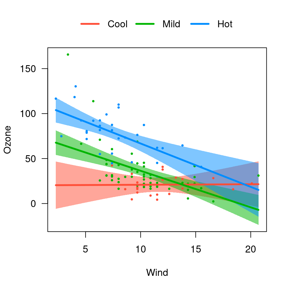
visreg(fit, "Heat", by="Wind", overlay=TRUE)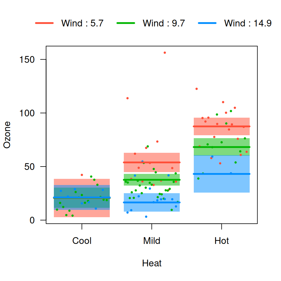
The options described in cross-sectional plots work in the same way here. For example,
In particular, the option strip.names is used in the
same way for consistency, even though there are no actual strips in an
overlay plot:
Changing the appearance of lines, etc., is accomplished in a similar
manner to other visreg plots,
although (1) you need to pass a vector to specify the appearance for
differeny by levels and (2) you need to be sure that you’re
correctly matching the colors of lines, points, and bands:
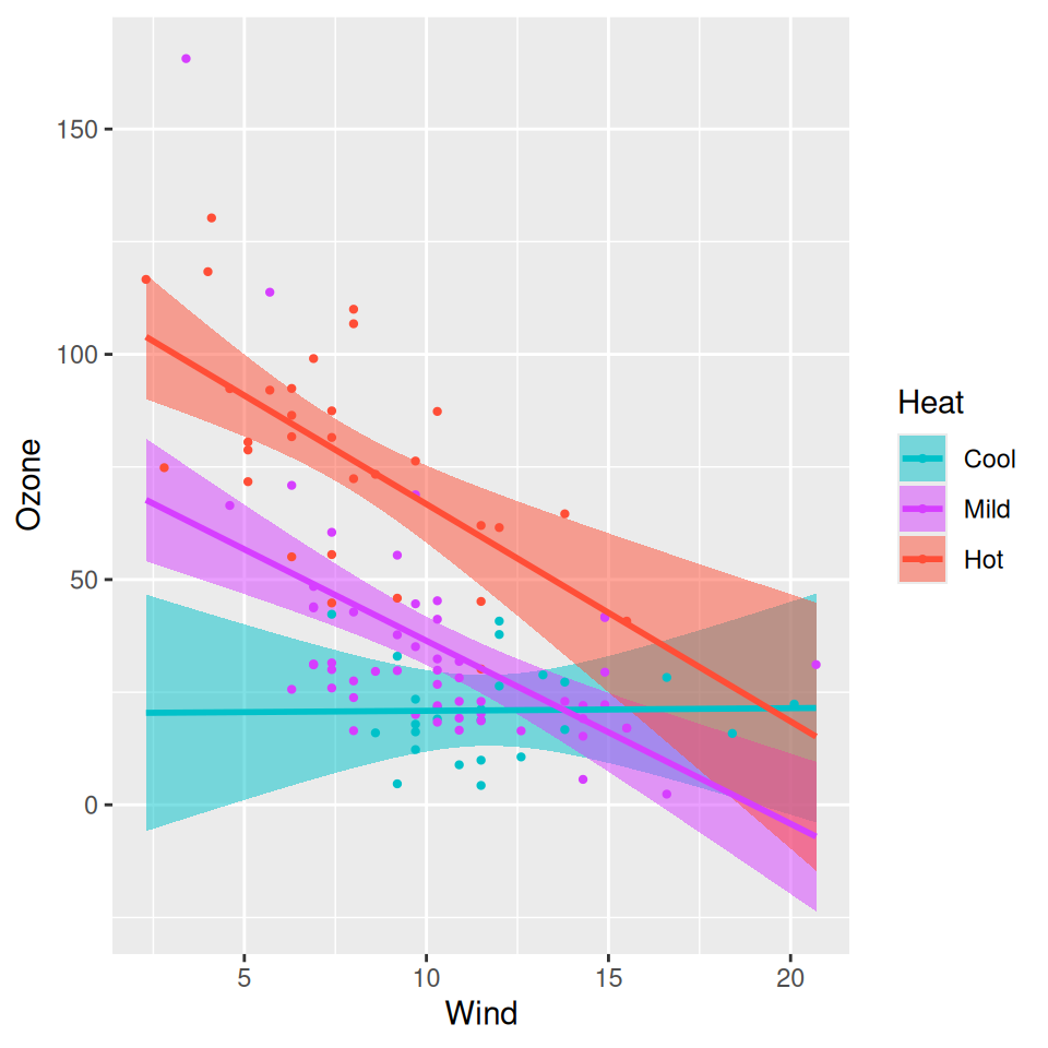
visreg(fit, "Wind", by="Heat", overlay=TRUE,
       line=list(col=c("#00C1C9", "#D63EFF", "#FF4E37"), lwd=1),
       fill=list(col=c("#00C1C980", "#D63EFF80", "#FF4E3780")),
       points=list(col=c("#00C1C9", "#D63EFF", "#FF4E37"), cex=1))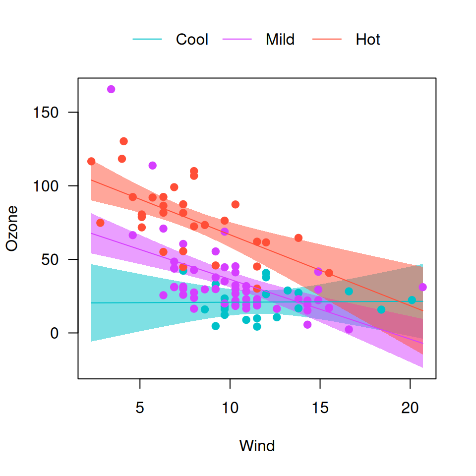
Note that you can still pass parameters as single elements
(cex=1); these will apply to all levels of
by.
For gg plots, the mechanism is different – the returned
plot can be modified with calls to scale_xxx_manual():
library(ggplot2)
visreg(fit, "Wind", by="Heat", overlay=TRUE, gg=TRUE) +
  scale_color_manual(values=c("#00C1C9", "#D63EFF", "#FF4E37")) +
  scale_fill_manual(values=c("#00C1C980", "#D63EFF80", "#FF4E3780"))